
Introduction
How do you approach a client’s concern about the navigation of their platform while keeping the end-users in mind? Do you use a standardized solution for a lower learning curve or create a customized solution that enhances the user experience over time? We chose the latter option as a design team focused on user experience. Here’s how we did it and what we learned.
The Challenge
One of our significant clients, Verve Motion, decided to refresh its platform by leveraging our UX/UI design services. Initially, we focused on understanding the current state of their platform, users, motives, and products. We spent considerable time analyzing stakeholders’ perspectives before creating any sketches.
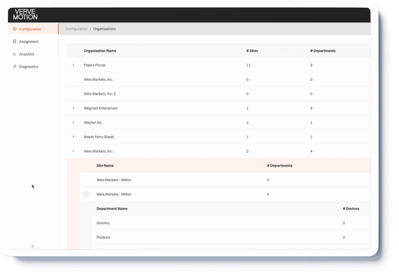
A major challenge was managing the three hierarchy levels in their platform: organizations, sites, and departments. Users needed to see a summary of these levels while also checking detailed information about one specific level. The existing collapsable menu was insufficient for these requirements.
The Design Process
After identifying the challenge, we started our UX research by examining the guidelines of Material Design, Ant Design, and other major frameworks to see if the navigation solutions they offered covered all the client requirements. We also studied companies with complex navigation systems but found that none matched our client’s unique business and hierarchy complexities.
Realizing we needed a custom solution, we considered factors such as user resistance to change, learning curves, and stakeholders’ fears and motivations. We then worked on a proof of concept that included all client requirements.
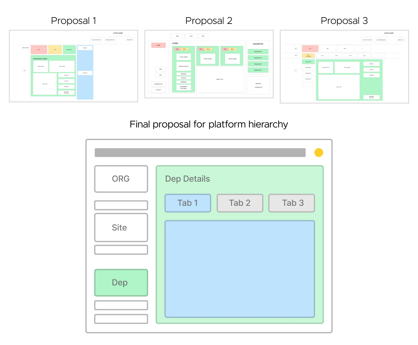 We documented everything we wanted to include, brainstormed ideas, and iterated on sketches. This process took time, but each iteration increased our confidence in the approach. Using Figma, we created high-fidelity wireframes to present to the client. This task was significant; we had to create all components from scratch, including existing and new ones for the proposed navigation system.
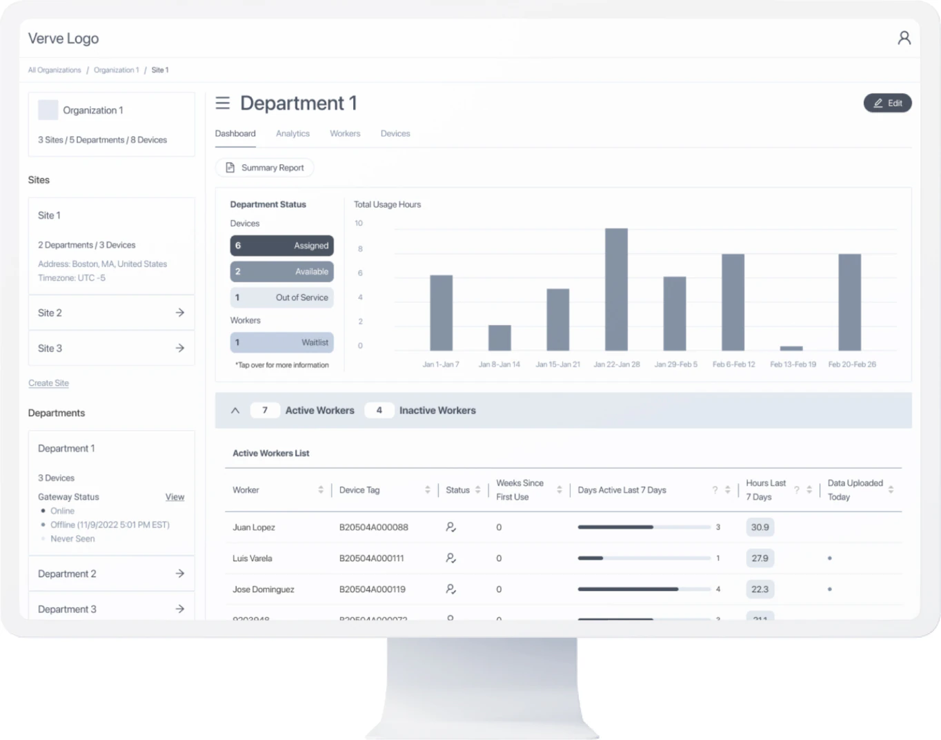
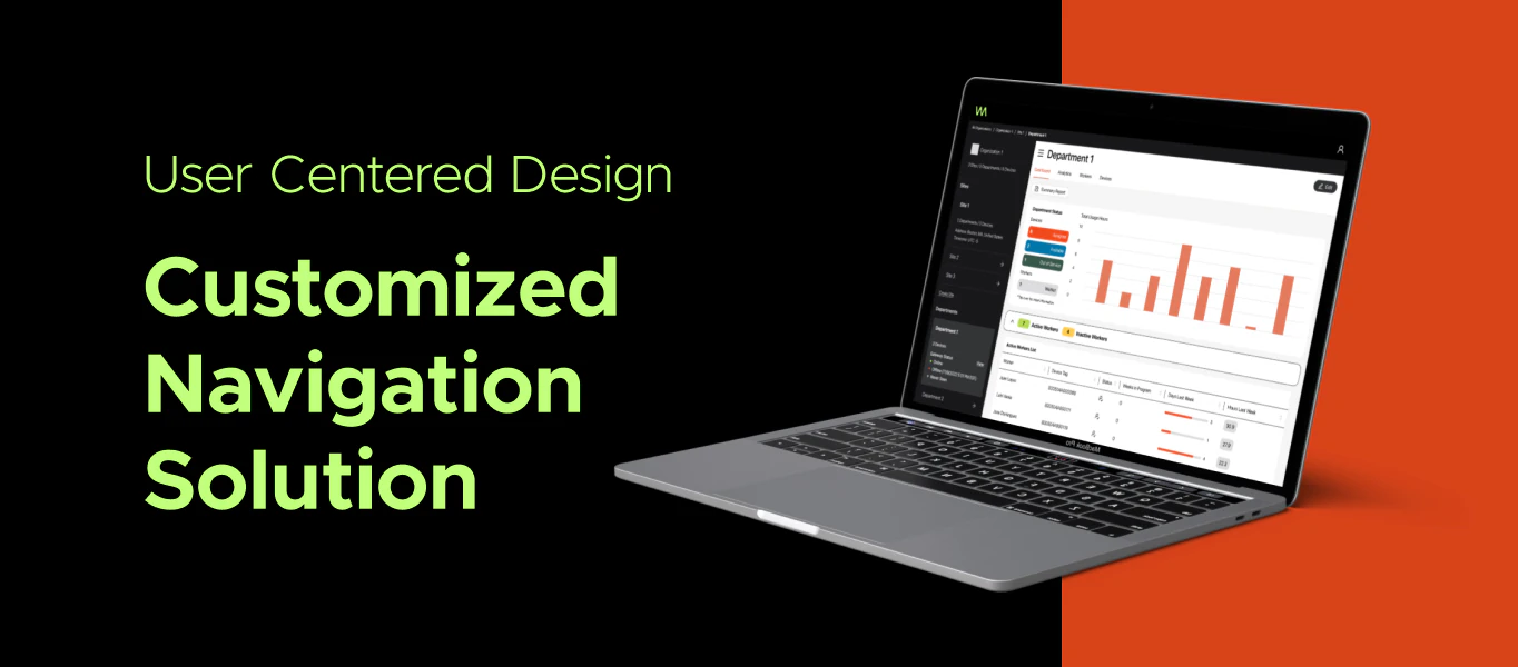
The final product was a left-side navigation menu that summarized each level. The top section showed a card for the organization level with an image, the number of sites, departments, devices, name, and address. Below, a sites section displayed cards for each site, showing the name by default but expanding to show detailed information when clicked. The department’s section, visible upon selecting a site, displayed cards with department details.
Additionally, clicking on any card in the navigation menu also updates the rest of the page with detailed information about the selected level, such as dashboards, analytics, and assignments.
Benefits
Our customized solution allowed users to quickly understand the organizational hierarchy and device allocation, enhancing their ability to interact with the platform. Each click provided an overview of a specific level, making the interaction more engaging and encouraging users to explore more features.
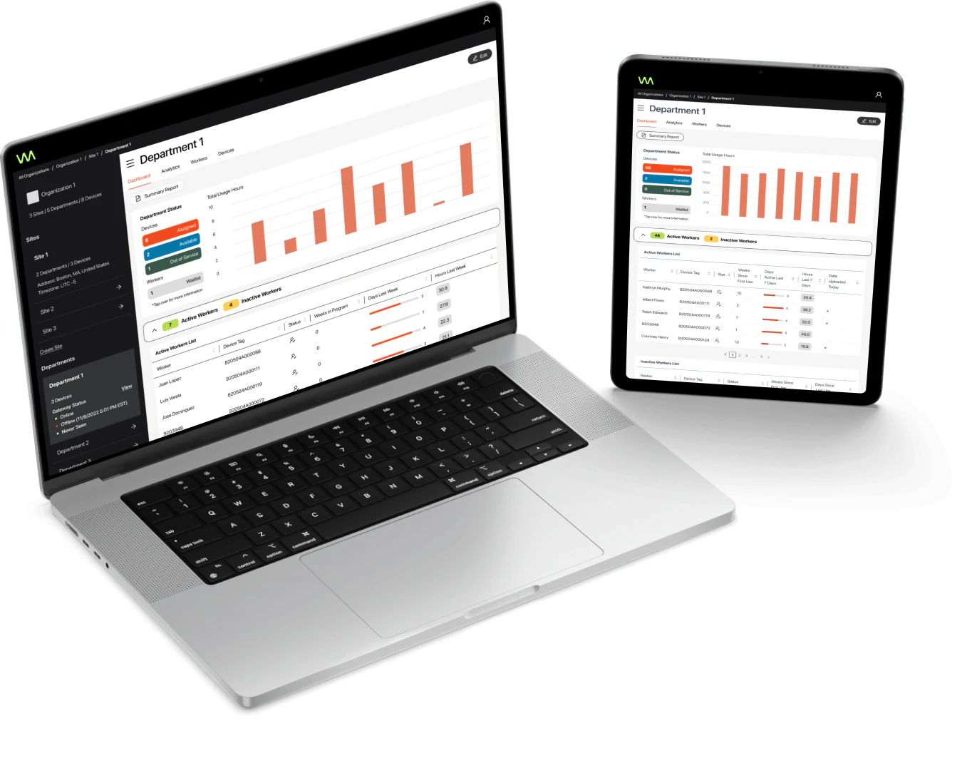
By tailoring the structure based on user needs, we created a platform that users enjoy, making their daily tasks easier and allowing them to focus on more critical activities like creating reports and supporting their teams.
Final Thoughts
Several months after the platform launch, we received excellent feedback from users and the client. They are satisfied with the new look and feel and have requested additional functionalities, which we are currently implementing.
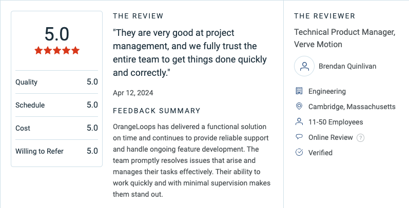
This process and its outcomes make us extremely proud as we advocate for user-centered design. Verve Motion’s trust allowed us to invest quality time in UX research, proof of concept, and final designs to achieve the best possible solution.
If you think your product needs a fresh look and feel, we are here to help. We would love to hear about your idea and collaborate to create a design that your users will enjoy.
Let’s talk for a consultation and start building the app or website of your dreams!