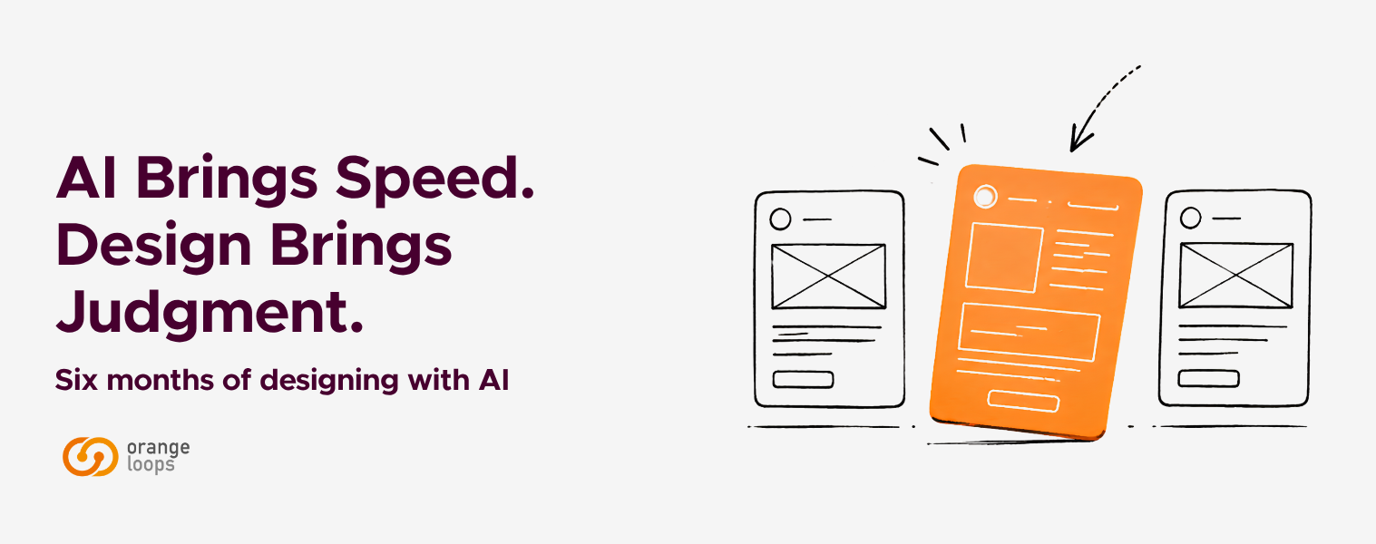
AI Brings Speed. Design Brings Judgment.
Six months of designing with the new wave of AI tools at OrangeLoops
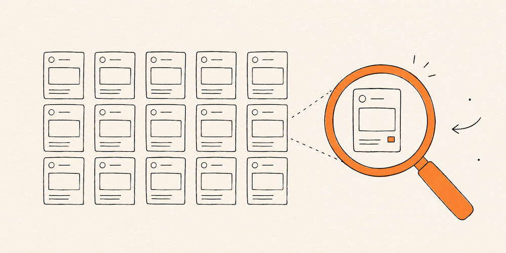
About six months ago, we described prompt-to-UI tools as more than hype, but far from a silver bullet. In the time since, the balance has shifted — not because the tools became perfect, but because they became impossible to ignore. The ecosystem is now deeper and more fragmented, with dozens of tools competing for a place in the workflow.
The interesting question is no longer whether these tools are useful. It’s how they are reshaping the work itself — and what they leave untouched. Generation has become a commodity. Anyone with access to these tools can produce screens, flows, and prototypes in minutes. What hasn’t become a commodity — and what these past months have made unmistakably clear — is the judgment behind those outputs: knowing what to ask for, what to discard, what to defend, and what the output is missing even when it looks complete. That’s not a nuance. It’s the line that separates a product that fits its users from one that just looks like it should.
At OrangeLoops, we’ve spent these months testing this new generation — Claude paired with Google Stitch, Claude inside Figma, V0, Lovable, and more recently Claude Design — sometimes in client work, sometimes in internal experiments designed to push them until they broke.
What follows isn’t a ranking. It’s a reflection on where these tools are actually adding value, where the hype still falls short, and what becomes more important — not less — as generation gets cheaper.
Why this shift feels different
The popular narrative about AI in design is simple: “now AI designs for you.” It’s easy to sell, easy to believe — and in practice, it doesn’t hold.
What’s actually happening is more structural. A significant portion of the design process used to be execution-heavy: translating wireframes into high-fidelity screens, refining layouts, building out component systems. Today, much of that execution can be initiated in one session. Design becomes less about producing artifacts and more about deciding what shouldn’t be produced manually — or at all.
And that decision is rarely obvious. It depends on weighing trade-offs, on reading the cultural context where a product lives, on hearing what a client doesn’t always know how to articulate. Those reads don’t come from a prompt.
Trade-off 1: Speed vs. coherence
 The most immediate effect of these tools is how dramatically they collapse the distance between imagining a product and seeing it. In our work, producing wireframes for a discovery used to take one to two weeks depending on complexity, and turning them into an interactive Figma prototype another two to three days. With AI in the loop, those same artifacts can stand up in a fraction of that time — shortening validation cycles and surfacing real feedback faster.
Tools like Claude Design, V0, and Lovable are particularly effective in this exploratory phase. The catch is that speed can easily be mistaken for understanding. Because these tools present output screen by screen, they invite evaluation at that level — while most meaningful design decisions actually happen across flows, states, and edge cases.
Control is the second dimension. Workflows where Claude operates directly on top of a Figma file are one of the most promising of the year — bringing AI closer to the design system itself, interacting with components, variables, and tokens within established constraints.
In a recent internal test, we asked Claude inside Figma to extend a flow using existing components. The output looked correct at first glance — but auto-layout settings drifted, spacing tokens were ignored, and a primary button quietly got recreated as a one-off. That experience changed how we set up our prompts and where we draw the line between generation and manual construction.
Less constrained tools tend to generate faster, but in a more generic way. A common visual language has started to emerge across them — clean, predictable, and often indistinguishable from one another. For products that need to differentiate, that’s a problem: coherence is always coherence with something — a brand, a context, a cultural frame — and defining that something is upstream of any prompt.
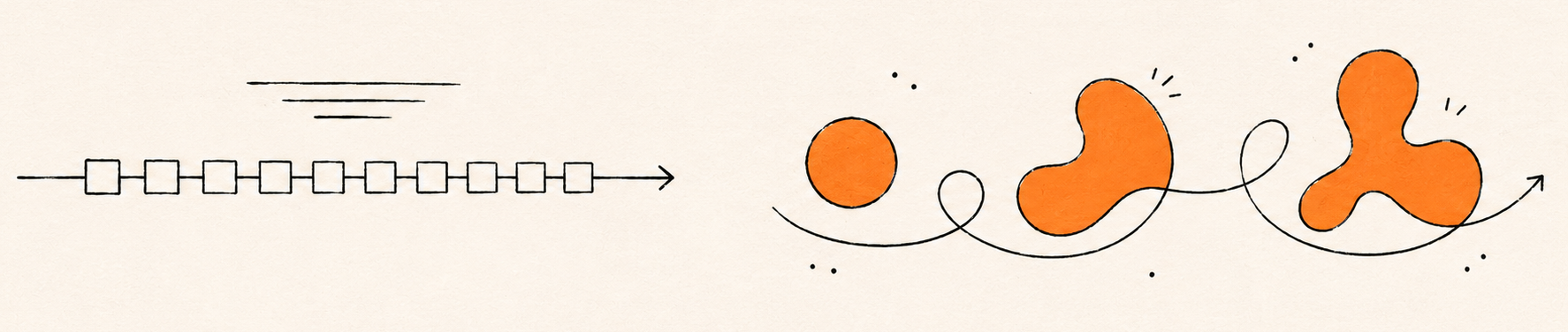
In practice, that work doesn’t live in a single tool. The workflow that has worked best for us isn’t linear, and it isn’t anchored to one environment — it’s a loop, with the shape changing project by project. Two patterns have emerged.
We tend to start with AI tools when the task involves volume, repetition with variations, or wide exploration. Recently, we had to design a report template for a client’s reporting feature that needed to accommodate many report types while keeping a consistent format, with large amounts of complex data to digest. Processing that data manually, clarifying it with the client, and proposing something coherent would have taken one to two weeks; by processing the information with Claude — under a defined set of UX and visual guidelines drawn from the project — and iterating in Stitch, we brought it down to roughly three days. The catch was real, though: inconsistencies in typography, sizes, and UI elements appeared between pages, and we had to bring the output back into Figma to resolve them by hand. The client was satisfied with the result, and we validated the workflow.
We tend to start with Figma when the task is about thinking through a solution with criteria, or extending an existing system coherently — and bring AI in later for a specific phase. On the same project, we designed a new section with interactive sliders driving progress-bar metrics. The first iteration was manual, using the file’s own components to stay consistent with the rest of the product. After client feedback, we needed to replace the sliders and turn the progress bars into a radial chart with indicators. We asked Claude, with the section’s context, to generate options. The slider direction took references from Claude’s output; the radial chart Claude drew inside Figma ended up being adopted in the final design, with only some manual refinement.
What stays constant across both patterns isn’t the toolchain — it’s the decision about which tool earns its place at each step, and why. The tools don’t make that call. Anyone who lets them is outsourcing the part of the job that actually defines the outcome.
Trade-off 2: Generation vs. Judgment
The second trade-off is less visible — and probably more critical. As generation gets cheaper, the cost of judgment goes up, because every output now needs to be interrogated before it becomes part of the product. And interrogation here means more than verification: it means asking whether the output addresses the right problem at all.
A similar pattern showed up in another project. We were designing a new section of cards, and the product already had several card patterns in use. We linked the full Figma file to Claude with an explicit instruction to follow the existing visual style. The output ignored it — not because the tool lacked context, but because having the system and reading the system are different things. A designer joining the project would have spent the first ten minutes scanning the existing variants and inferring the rules. The tool didn’t do that, and nothing in the prompt could force it to. The lesson wasn’t “give it more context.” It was that some kinds of context only become legible through interpretation, and interpretation is exactly the layer these tools don’t have.

AI-generated card output: visually generic, with no auto-layout and elements detached from the design system — despite having the full Figma file linked. Having the system isn’t the same as reading it.
And verification, when it’s needed, is only the surface of the problem. The harder kind of judgment sits earlier in the process: reading what a client is really after beyond the brief, deciding which trade-offs are worth taking on, choosing what not to build, defending an edge case that the average flow would erase. When that layer is missing, the output tends to be confidently generic — well-composed screens that solve a slightly wrong problem. The failure isn’t loud. It’s a product that looks fine and feels indistinct — and that kind of failure shows up months later, when no one is left to explain why each decision was made the way it was. The tool can produce the screen. It can’t be held accountable for it.
What this means for the designer’s role
Taken together, these shifts point to something interesting: the role is moving toward orchestration. The designer becomes an orchestrator — not the person producing every artifact, but the one deciding how those artifacts come into existence. We’re producing fewer artifacts by hand and spending more time deciding which artifacts should exist at all — which flows are worth exploring, which screens deserve manual care, which pieces of the system the AI shouldn’t touch.
Upstream, the work is about defining intent — what a product should mean to the people using it, which constraints are non-negotiable, which problem is actually worth solving.
Downstream, the work shifts toward refining, selecting, and deciding — wherever in the toolchain that work happens to land. Shaping hierarchy, ensuring accessibility, maintaining coherence, resolving edge cases, and pushing back on features that add weight without adding value. A lot of design judgment is subtractive: deciding what not to include, what to simplify, what to defend against scope creep. That instinct — less is more, applied with purpose — is precisely what these tools don’t have, because they optimize for plausible output, not for restraint.
This shift isn’t only happening within design. On recent projects, developers have started using tools like Claude Design to explore functionality that comes up in client conversations — generating a working interface before design has been formally involved. The artifact arrives at the design review already half-resolved, and the conversation changes shape: less “let’s design this,” more “let’s interrogate what’s already there.” That review isn’t a rubber stamp — it’s where the work gets sharper, where edge cases surface, where the system stays intact. Generation is moving across roles; judgment is what design is being asked to bring.
Key takeaways
These months of working with these tools — across client projects and internal experiments — left us with a few principles we keep coming back to:
- Producing output is no longer scarce. What is scarce is the judgment that decides what’s worth producing.
- Coherence is upstream of any prompt. Tools optimize for plausible output, not for fit with a brand, a context, or a user.
- Knowing when not to use a tool is becoming as important as knowing how to use it.
- Defending design decisions is part of the work. Tools generate options. Designers explain why a flow goes one way and not another, and stand behind that decision in front of clients and stakeholders.
- Generation is spreading across roles. Design is increasingly the layer of judgment over artifacts that arrive already half-resolved.
Being a designer in this context is less about how many screens you can produce, and more about which ones are worth producing in the first place — and why. AI brings speed. Design brings judgment. The first is now within anyone’s reach. The second is what we’re spending most of our energy on.