Introduction
The world of user interface design is constantly evolving. Tech giants like Apple and Google are pushing visual and functional boundaries to create experiences that are not only usable but also emotionally engaging.
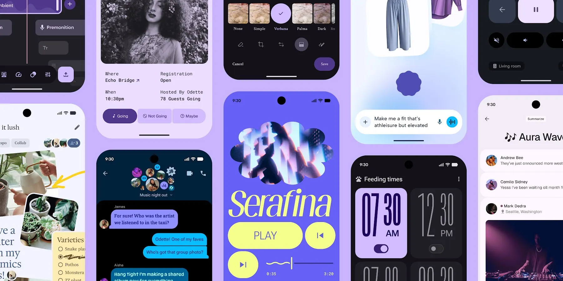
Two of the most recent and impactful design languages are Liquid Glass (Apple) and Material 3 Expressive (Google), which were launched this year (2025), and they are showing us how the future of UI is evolving.
But first, What Are Liquid Glass and Material 3 Expressive?
Liquid Glass (LG)
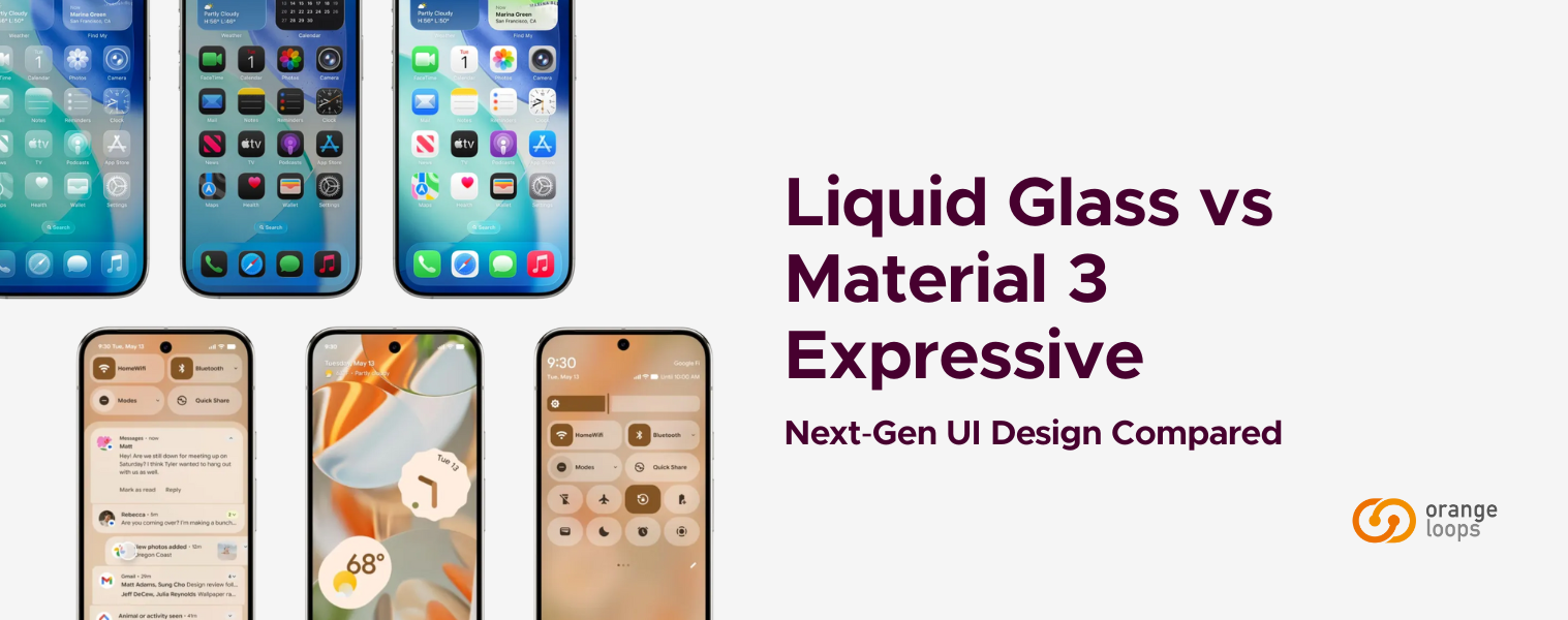
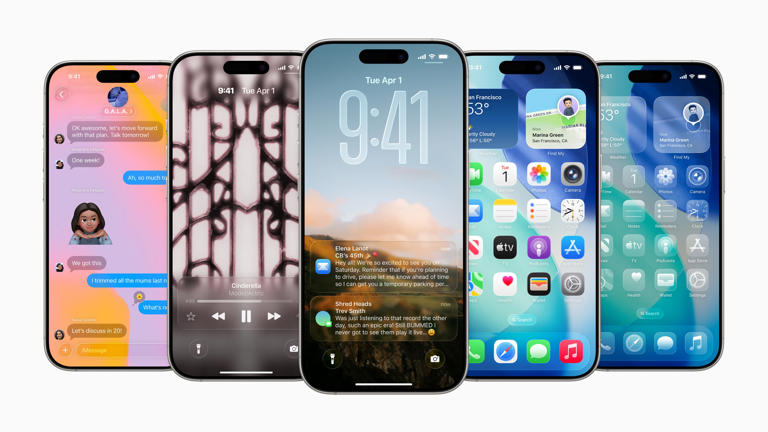
Unveiled by Apple in 2025, Liquid Glass is a new dynamic material featured across Apple platforms, including iOS, iPadOS, macOS, tvOS, and watchOS. It is described as combining the optical properties of glass with a sense of fluidity.
Liquid Glass forms a distinct, functional layer for navigation elements and controls. It is a system-wide overhaul inspired by visionOS, emphasizing translucency, reflections, and dynamic animations. The design employs real-time rendering to simulate light refraction and includes specular highlights that vary with device motion. This material affects how the interface moves, looks, and feels, adapting to various factors to help draw focus to the underlying content.
Key characteristics include:
- Depth (Hierarchy and Layering): Liquid Glass is fundamentally designed to create a strong sense of depth, layering, and visual hierarchy within the interface. It introduces a floating functional layer that defines the primary navigation structures—such as tab bars and sidebars—and visually separates them from the underlying content. This top layer, “oats,” overlies the rest of the interface, creating a clear distinction between functional and informational elements.
The system also leverages dynamic depth, allowing content to scroll and subtly peek through elements above it. This creates a sense of movement and dimensionality while keeping key controls legible. Additionally, refraction and shadow effects contribute to the illusion of depth by interacting with the background, casting soft shadows and darkening patterns that respond to the shapes and surfaces above them.
- Material (Optical Properties and Variants): Liquid Glass derives its name from its unique optical behavior, which blends the transparency of glass with the fluid motion of a liquid. The material dynamically simulates reflection, refraction, blur, and highlights, adapting in real time to light and background conditions.
Apple provides two primary variants of this material. The regular variant focuses on legibility: it applies stronger blurring and controlled luminance adjustments to ensure that text and interface elements
remain legible regardless of background complexity. Conversely, the clear variant prioritizes immersion. It is more transparent and designed for components that float above rich visual content, such as images or video, allowing users to form a deeper connection with the underlying media while maintaining functional clarity.
- Hardware (Shape and Concentricity): The Liquid Glass design language is tightly integrated with Apple’s hardware design philosophy, ensuring coherence between physical form and digital interface. The curvature of devices informs the rounded geometry of on-screen elements such as windows, popovers, and controls, reinforcing a sense of harmony between the product’s hardware and software. Many interface components are nestled into the curved corners of displays and containers, producing smooth visual continuity that feels intentional and unified.
This concept of universal concentricity extends to app icons and other visual standards, which are consistently designed to align with the device’s physical contours. The result is a cohesive aesthetic that makes every Apple device feel like a seamless blend of hardware and interface.
Material 3 Expressive (M3E)
Material 3 Expressive focuses on creating emotionally impactful user experiences (UX). The update is an expansion pack of new components and capabilities designed to add “emotional oomph” to UIs, ensuring users feel a deeper connection to the product, find it easier to use, and experience more joy from key interactions. It aims to express a mood through new motion physics, unexpected shapes, and eye-catching colors, ultimately making the user “feel something”.
M3 Expressive is rooted in extensive user research. It is the most extensively studied update to Google’s design system, supported by 46 studies and more than 18,000 participants worldwide. It prioritizes usability and customization, balancing form and function.
The fundamental elements of M3 Expressive design include shape, color, and motion.
- Shape: Material 3 Expressive introduces a significant evolution of the shape system, expanding the ways in which form contributes to personality and hierarchy within the interface. The new shape library includes more than thirty-five expressive geometries that allow designers to add decorative and playful visual elements, perfect for avatars, bespoke buttons, or branded accents.
The
shape scale has been expanded to 10 corner-radius values, giving designers finer control to create visual tension or cohesion, depending on context. This helps direct attention and strengthen brand identity across components. Additionally, shape morphing animation is now natively supported, enabling smooth transitions between forms (for example, a circle morphing into a square when pressed). This dynamic responsiveness turns static components into living, tactile elements that enhance user engagement.
- Color: In Material 3 Expressive, color takes center stage as both a functional and emotional tool. The Dynamic Color system has been upgraded to support higher chroma and greater hue variation, offering users and brands a richer palette for personalization, ranging from subtle neutrals to vivid, energetic tones. These color improvements automatically cascade to apps adopting the latest Android theme, ensuring consistency and vibrancy across the ecosystem. Text and icons are brighter, enhancing visual clarity and reinforcing hierarchy, especially for key actions and brand elements.
Designers are encouraged to
use multilayered palettes (primary, secondary, and tertiary accents) to create depth, contrast, and accessibility. Together, these refinements make Material 3 Expressive more adaptable, personal, and visually striking without compromising legibility.
- Motion: Motion has been elevated to a core design system in Material 3 Expressive, unifying animation behavior through a tokenized, physics-based model. Instead of relying on manually defined durations or easing curves, designers and developers can now use motion tokens, predefined spring values that ensure consistency and fluidity throughout the UI.
These
physics-based springs simulate natural movement, making interactions feel intuitive and alive. The motion framework supports both spatial transitions (how elements move and occupy space) and effect transitions (color and opacity changes), allowing smooth, coherent shifts between states. With motion now built into more than twenty-one components, expressive movement is no longer an afterthought; it’s an integrated part of the user experience, reinforcing the emotional and physical realism that defines Material 3 Expressive.
Why should we compare Liquid Glass & Material 3 Expressive?
We should compare Apple’s Liquid Glass and Google’s Material Expressive because both design systems are addressing the same challenge—making interfaces feel more personal and emotionally engaging—but through very different strategies. With both rolling out this year, this is the perfect moment to look at how each of the two dominant ecosystems is redefining visual and emotional interaction in UI.
Liquid Glass achieves this through tactile depth, fluid translucency, and hardware harmony, while Material 3 Expressive focuses on adaptable shapes, vibrant color systems, and physics-based motion. By analyzing their contrasts and overlaps, we can identify which principles to adopt, where to differentiate, and how to ensure our products remain accessible, performant, and consistent with our brand identity across platforms.
Comparison Between Liquid Glass and Material 3 Expressive
Let’s examine both systems from broader aesthetics down to functional details:
- Aesthetic Priority:
- In terms of aesthetics, Liquid Glass and Material 3 Expressive take fundamentally different paths toward the same goal: creating interfaces that feel alive. Liquid Glass pursues physical realism. It’s glossy, fluid, and light-reactive, evoking the sensation of real glass that shifts and refracts as you move. This gives Apple’s interface a premium, futuristic presence that feels tangible and luxurious.
- In contrast, Material 3 Expressive focuses on emotional resonance. It uses bold, adaptive shapes, vibrant color palettes generated from the user’s wallpaper or brand identity, and motion grounded in physics to make the experience feel personal and dynamic. In essence, Liquid Glass is designed to be felt, while Material 3 Expressive is designed to connect.
- Core Layering:
- In layering, Liquid Glass establishes a clear separation between interface elements and content. It introduces a floating functional layer (a translucent sheet that hovers above the rest of the UI), creating a strong sense of depth and spatial hierarchy. This approach gives Apple’s system a tactile, dimensional feel, in which navigation and controls appear to exist above the content.
- In contrast, Material 3 Expressive takes a more integrated approach. Rather than adding new visual layers, it works within the existing hierarchy, using tokens, typography, elevation, and motion to subtly guide attention. The emphasis is not on separation but on flow, ensuring that essential elements stand out naturally as part of the content while maintaining a cohesive and fluid user experience.
- Usability Standing:
- In terms of usability, the contrast between the two systems becomes especially clear. Liquid Glass delivers a visually stunning and immersive experience, but its pursuit of realism can sometimes challenge practicality. When transparency or lighting effects dominate, legibility may suffer, particularly for text or icons layered over complex backgrounds. It’s a system designed to captivate, though occasionally at the cost of clarity.
- On the other hand, Material 3 Expressive places usability and performance at the center of its philosophy. Backed by Google’s research, it leverages expressive tokens, motion, and dynamic color to improve navigation flow and reduce cognitive load. The result is an interface that feels lively yet efficient. In short, while Liquid Glass emphasizes spectacle and immersion, Material 3 Expressive prioritizes clarity and speed, two different interpretations of what it means to create an engaging user experience.
- Innovation Type:
- Liquid Glass represents a bold, system-wide reinvention of Apple’s visual language. It reshapes the look and feel of nearly every interface element across the ecosystem, redefining how light, depth, and materiality behave in the Apple experience. This isn’t just an update; it’s a statement of direction, signaling a new era of immersive, tactile realism that tightly aligns with Apple’s hardware and brand identity.
- In contrast, Material 3 Expressive represents a strategic evolution rather than a revolution. It builds on the well-established foundation of Material Design, adding greater flexibility, personalization, and emotional expressiveness while maintaining compatibility with existing design and development frameworks. Rather than reinventing the system, Google refines it, modernizing the experience without disrupting continuity for users or creators.
Conclusion
In the end, Liquid Glass and Material 3 Expressive stand as two distinct yet equally ambitious interpretations of the future of user interface design. Apple’s Liquid Glass represents a significant advance in physical realism, embracing light, depth, and translucency to create a tactile, futuristic aesthetic that feels premium and immersive. Google’s Material 3 Expressive, meanwhile, embodies function through emotion, a system that blends expressive color, shape, and motion to make interfaces both beautiful and intuitive.
The comparison between the two reveals a broader tension in modern design: flair versus function, or spectacle versus clarity. Liquid Glass dazzles, but risks usability when visual effects outweigh legibility; Material 3 Expressive inspires, yet remains grounded in accessibility and performance.
Neither approach is inherently superior; their success depends on how teams implement, balance, and adapt these philosophies. When designers and developers collaborate with intention, both systems have the potential to deliver interfaces that not only look remarkable but also feel deeply human.
If you need a hand navigating these changes to the UX and UI of mobile apps, let’s talk! We’d love to help.