Since its launch in January 2024, the innovative Vision Pro has captivated the world. This is not only because of the expectations associated with a new Apple product but also due to the potential of cutting-edge technology that uniquely combines VR and AR, which could significantly impact how we interact with the world. Vision Pro’s Spatial Design leads the industry into an expansive realm of immersive, intuitive, and meaningful experiences. In this article, we will explore its strengths and the challenges it presents for user experiences in this new generation of digital products.
1) A Path Toward Evolution, But Still in Progress.
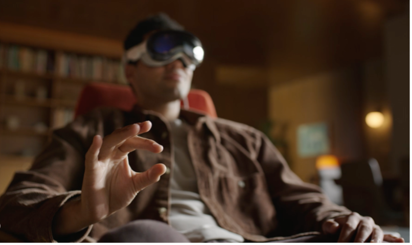
Vision Pro has made a significant leap toward innovation in the immersive digital world. This device operates without traditional controls, utilizing hand gestures, voice commands, and eye tracking instead. This approach provides a unique experience and promises a more natural and fluid interaction, eliminating physical barriers between the user and the virtual content. However, this innovative design also raises a series of challenges, particularly regarding accessibility and usability.
From a hardware user experience perspective, Vision Pro faces certain challenges. The most common complaint reported by users is around physical discomfort, such as facial redness and migraines after prolonged use. These adverse effects appear to be partly related to the device’s weight, which can become a significant pain point during extended periods of use. Additionally, the “time of use” factor plays an important role, as increased usage duration heightens the likelihood of experiencing these issues. This highlights the need to improve the device’s ergonomic design, with a focus on reducing its weight and optimizing weight distribution to minimize the physical impact on the user.
Regarding the interface, Vision Pro introduces an interaction method that also presents significant challenges. Without physical controllers, the user must focus their gaze on a specific point to interact with buttons or other interface elements. While this approach allows for more direct interaction, maintaining a fixed gaze can be uncomfortable and unintuitive. In everyday life, we don’t typically activate or manipulate objects solely with our eyes, making this interaction method feel somewhat forced and less natural. This feature contradicts one of Jakob Nielsen’s usability laws, which advocates for a match between the system and the real world; that is, systems should be designed to reflect how people think and act in reality.
From an accessibility perspective, gaze-based interaction can be particularly challenging for individuals with visual impairments or limitations, as they may find it difficult to engage with certain UI elements. It is also worth noting that eye-tracking controllers must be configured by each user based on their unique viewing profile, which can create challenges when sharing the device with others. Given that inclusivity is essential in the design of technological products, accessibility must be prioritized to ensure that everyone, regardless of their abilities, can use the device effectively. The lack of alternative interaction options could significantly limit the usability of Vision Pro, potentially impacting the experience for a considerable portion of users.

2) Balancing Innovation and Cognitive Load
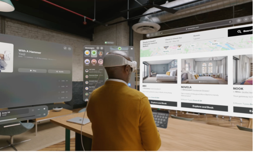
Vision Pro’s Spatial Design stands out by offering a wide range of options for content display, from individual three-dimensional objects dispersed in space to an unlimited number of simultaneously open apps, along with impressive full-screen projections. At first glance, the system’s interface appears to provide exceptional flexibility that is both appealing and innovative. However, the potential to display such a large amount of information at once could lead to cognitive overload, increasing the risk of users feeling overwhelmed.
While users of devices like the iPhone or iPad may have multiple apps open, interaction is typically limited to one active window at a time. In contrast, Vision Pro enables users to view and interact with multiple apps and content simultaneously, creating a completely different user experience. Although this simultaneous capability is powerful and engaging, it can present significant challenges. Among the potential consequences are difficulties in effectively processing information and making informed decisions.
Managing multiple windows in a three-dimensional environment can complicate navigation and lead to visual hierarchy issues, making it difficult for users to understand which window is most important or where they should focus their attention.
Moreover, there is a high risk of cognitive overload and fatigue due to the mixed content being displayed. This can cause the user to lose engagement with the platform and lead to a potentially negative experience.

3) Is Glassmorphism the Right Choice?
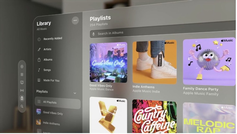
The interface design feels familiar to anyone who has used other Apple devices. Icons and standard UI elements are displayed consistently with other products from the same brand. However, with the launch of the Vision Pro, Apple has also placed particular emphasis on visual realism. Some supporting interface elements feature shadows, transparencies, and textures that closely mimic our physical world. In this context, Glassmorphism gains significant relevance.
Let’s recall that Glassmorphism is a visual design trend that has become bigger since 2020 and is characterized by the use of transparency effects, blurring, and overlapping layers, creating an appearance that resembles frosted glass. This style not only aims to offer an aesthetically pleasing look but also seeks to provide a sense of depth and dimensionality within digital interfaces, making elements appear to “float” in a three-dimensional space.
Some leading tech companies have embraced this trend in their interface designs, with notable examples being Microsoft Office and Windows 11. In these platforms, Glassmorphism is evident through the use of translucent windows, blurred backgrounds, and subtle layering effects. In this context, Apple has also chosen to adopt Glassmorphism, integrating these design principles into Spatial Design’s interface.
A particularly significant element of Apple’s proposed visual language is the “spatial window,” designed entirely with a “glass material.” This feature enables users to interact with the interface seamlessly while still observing their surroundings, promoting an immersive experience that connects them to the real world.
It is particularly fascinating to observe how Apple is championing Glassmorphism, encouraging designers and developers to incorporate this design trend as they navigate the evolving landscape of virtual reality. This approach aligns well with the emphasis on creating organic and immersive experiences, as the smooth, translucent elements help to create a sense of depth and realism that can enhance user engagement.
However, the accessibility challenges associated with Glassmorphism cannot be overlooked. One key concern is the frequent lack of sufficient contrast between text and background, which can make it difficult for users to read content comfortably, especially in noisy surroundings. This low contrast might result in eye strain, especially during extended periods of use, which can greatly diminish the overall experience for individuals who may already have visual impairments or sensitivity to low contrast. Therefore, while Glassmorphism presents exciting design possibilities, it also raises important considerations around readability that must be addressed to ensure a more inclusive experience.
This raises a crucial challenge: how can we balance the appealing aesthetics of Glassmorphism with the imperative need to ensure optimal usability for all users, regardless of their visual capabilities?
I believe it is essential to make design decisions based on the context of use, especially in situations involving a three-dimensional space where the variables of depth, shadows, and lighting play a crucial role. Glassmorphism stands out elegantly and integrates well into these types of environments. However, I see opportunities for improvement in content presentation, particularly in achieving a default adaptation of the UI to its surroundings. By adjusting these elements, the content can stand out more effectively against the background, thereby enhancing readability and making it clearer and more accessible for the user.

4) Conclusion
In conclusion, Vision Pro is a groundbreaking step in spatial design, blending innovative interactions with immersive visuals that redefine VR and AR experiences. However, challenges like gaze-based interactions, cognitive load, and accessibility concerns with Glassmorphism highlight the need for further refinement. Balancing these aspects will be essential for improving comfort and inclusivity, ensuring Vision Pro’s appeal to a broad audience. As Apple continues to evolve this technology, prioritizing user-centered design will be vital to achieving a fully successful transformative experience in the immersive digital landscape.

