Introduction
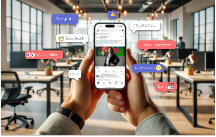
In the world of professional networking, notifications play a crucial role in keeping users engaged and informed. However, when not effectively managed, notifications can lead to frustration and overwhelm. Our recent case study on LinkedIn notifications attempts to address these issues by understanding user needs, analyzing existing systems, and proposing actionable improvements. This blog post provides an overview of our research process, findings, and final proposals.
Step 1: Understanding User Personas
LinkedIn’s statistics show that a significant portion of users (60.1%) are between the ages of 25 and 34, and the majority access the platform on mobile devices. Users seek professional connections and optimized visibility through post interaction, but many feel overwhelmed by excessive and irrelevant notifications.
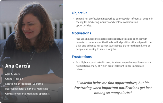
To kick off our study, we developed a user persona. We focused on Ana Garcia, a 29-year-old Digital Marketing Specialist based in San Francisco. Ana is actively seeking to expand her network and find job opportunities. Her primary challenge is managing the overwhelming influx of notifications, which often results in important alerts getting lost in the noise.
Step 2: Data Collection and User Research
To understand user interactions with LinkedIn notifications, we employed a mixed-methods approach, including:
- Surveys: Conducted to reach a broader audience, gathering quantitative data on user behavior and satisfaction.
- Interviews: Conducted with several users to dive deeper into their experiences and frustrations with LinkedIn notifications.
Key Findings from the research:
- User Behavior: While users frequently see notifications, many do not interact with them. This indicates a disconnect between notification relevance and user engagement.
- Configuration Challenges: Many users reported difficulties in customizing their notification settings, citing the process as a significant pain point.
- Relevance: Over 80% of users felt that the notifications they received were irrelevant, emphasizing a need for better-targeted alerts.
- Desire for Control: Users expressed a strong desire for features that allow them to manage their notifications actively and easily.
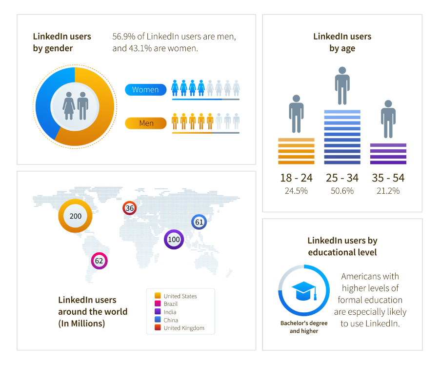 Infographic by Juanita Ramirez. Data from the following websites:
*https://www.statista.com/statistics/273505/global-linkedin-age-group/#:~:text=Distribution%20of%20LinkedIn%20users%20worldwide%20as%20of%20April%202024%2C%20by%20age%20group
*https://datareportal.com/essential-linkedin-stats#:~:text=Which%20countries%20have%20the%20most%20LinkedIn%20users%20in%202023%3F
Step 3: Competitive Analysis
We conducted a comparative analysis of how other platforms handle notifications.
While Glassdoor (known for company reviews and salary information, also provides job listings and company insights) allows customization of job alerts, it lacks granular notification controls compared to Instagram (known for its high user engagement and effective use of notifications to keep users active on the platform), which offers detailed settings for various notification types.
This analysis highlighted the potential for LinkedIn to adopt more effective notification management strategies.
Step 4: Brainstorming Ideas for Improvement
After gathering insights from user feedback and competitive analysis, we brainstormed several proposals for improving LinkedIn notifications:
- Mark All as Read: Introduce a feature to allow users to mark all notifications as read with a single click.
- Organized Categories: Group notifications into clear categories (e.g., Job Alerts, Recommended Content) for better organization.
- Streamlined Configuration: Simplify the notification configuration process, with a maximum of five general options and an advanced settings area for detailed adjustments.
- Notification Summaries: Provide daily summaries of unread notifications for users who do not access the platform regularly.
- Enhanced User Control: Allow users to select their preferred channels for notifications (email, push, or in app notifications) and enable quick opt-out options for specific types.
Step 5: Final Proposal
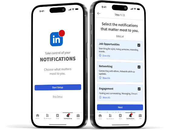
Based on the brainstorming sessions, user feedback, and competitive analysis, we developed a comprehensive proposal aimed at enhancing the LinkedIn notification experience:
Proposal Structure:
- User-Centric Setup Process:
- A guided setup process for new users or after major updates to help personalize notifications effectively.
- Step-by-Step Configuration:
- Step 1: Introduction – A welcoming screen explaining the importance of customizing notifications.
- Step 2: Notification Categories – Users can toggle specific categories to activate or deactivate (e.g., Job Alerts, Connection Requests).
- Step 3: Channel Selection – Allow users to choose how they want to receive notifications (email, push, or in app).
- Step 4: Summary and Confirmation – A review screen to confirm settings, ensuring users can modify any configurations easily.
- Step 5: Finalization – A confirmation message that preferences have been saved.
- Organized Notification Interface:
- Create a dedicated section for notifications categorized into:
- Important: High-priority notifications marked by users.
- All Notifications: A general feed for less important alerts.
- Others Notifications: Notifications that users have read or dismissed, allowing for easy retrieval.
- Create a dedicated section for notifications categorized into:
- Improved User Engagement:
- Implement actions within notifications to facilitate easier interaction and control. For example, allow users to long-press on a notification for quick actions, such as selecting multiple notifications, marking them as read, moving them to the ‘Others’ section, or deleting them all at once. These actions help users quickly manage their notifications without opening additional screens.
Conclusion
Our case study highlights the critical need for a more user-centered approach to LinkedIn notifications. By understanding user personas, gathering extensive data, and analyzing competitive platforms, we identified key areas for improvement. The final proposals emphasize user control, relevance, and simplicity, which are essential for enhancing the overall experience on LinkedIn.
By implementing these changes, LinkedIn can foster a more engaging and personalized environment for its users, ultimately leading to higher satisfaction and increased interaction with the platform. As the digital landscape continues to evolve, prioritizing user needs will be paramount in maintaining LinkedIn’s position as a leading professional networking site.
Invitation to Collaborate
As we strive to create products that resonate with users, we invite company owners and aspiring entrepreneurs to partner with us. Our UX services are designed to enhance your product or develop new solutions that are truly user centered. Together, we can elevate your brand and ensure your offerings meet the needs of your audience effectively. Reach out to us today to explore how we can collaborate to drive innovation and success in your business!
